Six photo gallery layouts: why "beautiful" is not "usable"
Each layout solves its own problem: uniform grid for comparison, masonry for browsing, curated grid for everything else.
Each layout solves its own problem: uniform grid for comparison, masonry for browsing, curated grid for everything else.
Pinterest built masonry. It was their signature move from 2011 — variable card heights, dense packing, no cropping, an aesthetically alive rhythm. The perfect inspiration gallery. For ten years, everyone copied the idea: Unsplash, Behance, Erik Johansson, half the photography portfolios on the internet.
Then Pinterest started walking it back. Not everywhere — but in search. For a specific query like "Scandinavian IKEA sofa", Pinterest returned to a plain grid with predictable cells, because the user searching for that doesn't want to wander through inspiration — they want to compare options. And masonry, for all its aesthetic virtues, breaks that scenario.
That is the whole point. A photo gallery layout is not an aesthetic choice. It is a behavioural choice. When the user is comparing options (products, hotels, screenshots), they need one layout. When they are browsing for inspiration, they need another. There is no universal answer, and the attempts to find one are the main source of bad galleries in production.
Central thesis. The choice of photo gallery layout is dictated by what the user is doing — searching for something specific, or browsing. For "searching", uniform grid with pagination works. For "browsing", masonry works (but only with the native CSS implementation once it lands). For mixed or unknown scenarios, the safe default is curated grid with object-fit: cover, 3–4 columns, pagination every 24–36 items.
All hostnames, public-site screenshots, source links and eyetracking images in this material are real public data. Any resemblance to internal dashboards is coincidental.
There are two modes a photo gallery lives in. They are different modes, and they call for different interfaces.
Browse — the user does not know what they are looking for. They came for inspiration, ideas, "show me something beautiful". This mode rewards high content density, variable sizes, infinite scroll. The more you show, the more chance they latch on. NN/g calls this browsing and underlines the point: in this mode, the user is willing to scroll for a long time (Hoa Loranger, NN/g, 2014).
Find — the user knows what they want. A specific product, a specific hotel, a specific screenshot for a presentation. This mode rewards predictability: the user scans rows left to right, expects to see "page 3 of 12", gets nervous when the footer is missing. NN/g and Baymard agree: for goal-oriented tasks, pagination beats infinite scroll.
Key takeaway: mixing the two modes in one gallery is a failure. If a product catalogue and an "inspiration" section live in the same grid, you either kill the find experience (endless feed for someone who wants to find) or kill the browse experience (pagination for someone who is wandering). Pinterest figured this out and split the modes across pages.
Six layouts next. Each one covers its own scenario, each one has its own price.
Fixed cells of the same size, aligned to a grid. The eye scans the rows like a spreadsheet.

Screenshot of Amazon via image.thum.io. The "headphones" category — fixed square cells, predictable scanning.
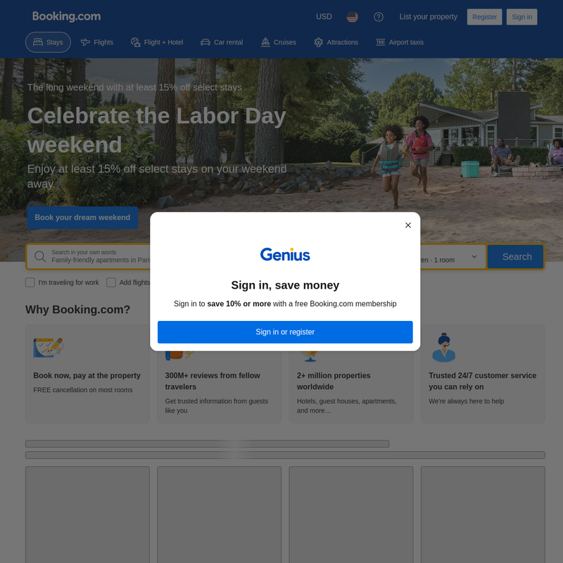
Screenshot of Booking.com via image.thum.io. Same pattern, same logic — the user is comparing options.
When it works. E-commerce categories, service catalogues, any list where the user is comparing items. Canonical examples: Amazon, IKEA, Booking. This is the default for the find mode.
Why it works. The grid naturally matches the F-shaped reading pattern. The eye scans the first row left to right, then drops a bit and scans left to right again, then drops again — an empirically established pattern (Kara Pernice, NN/g, 2017). When cells are aligned, the user spends no attention on coordination — it stays on the content.
The price. Identical cells cut photographs. Vertical portraits in a square lose half the frame. If the content is mixed (some horizontal landscapes, some vertical portraits), uniform grid starts cropping good shots badly.
Implementation. Native CSS Grid, zero JavaScript, best LCP. Technically the cheapest layout of the six.
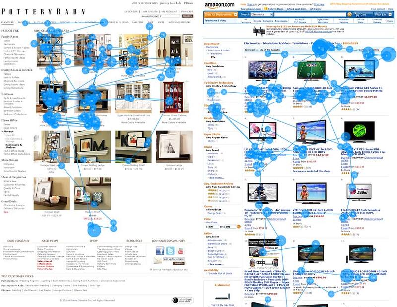
Source: Jakob Nielsen, "Photos as Web Content", NN/g, 2010. A comparison of Pottery Barn (optimised thumbnails) and Amazon (standardised thumbnails) — in both cases, product thumbnails are actively studied when the photo is informative.
Variable card heights, packed densely bottom-up. No cropping — every photo keeps its aspect ratio.
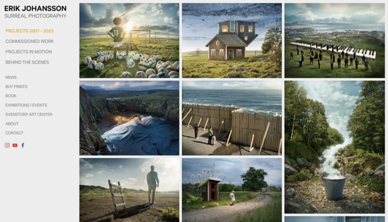
Source: Erik Johansson, Smashing Magazine CDN. A canonical example — every photo in its own size, dense packing without cropping.
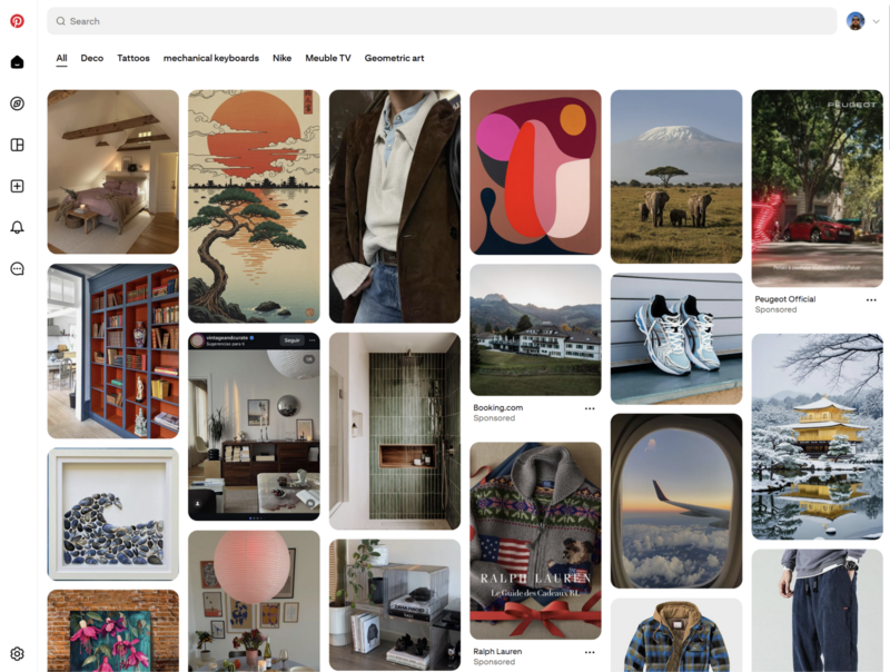
Source: Pinterest, Smashing Magazine CDN. Same idea, same density, millions of cards.

Screenshot of Kristian Hammerstad via image.thum.io.
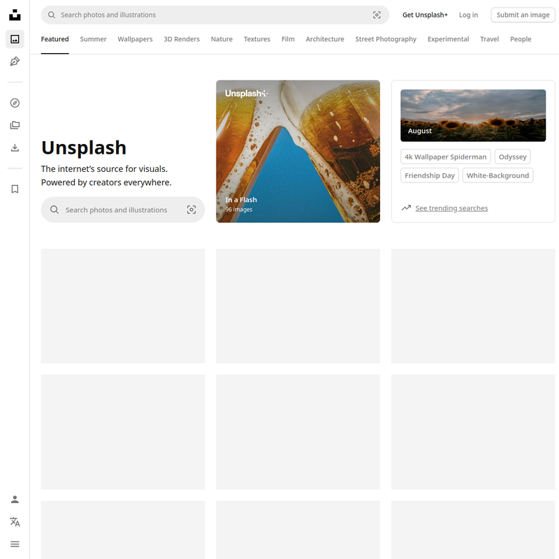
Screenshot of Unsplash via image.thum.io.
When it works. Browse mode: inspiration, photo communities, photography portfolios, photo discovery. The user is wandering, not searching. Canonical examples: Pinterest, Unsplash, Behance, Erik Johansson, Kristian Hammerstad.
Why it works. Maximum content density per unit area. No cropping. An aesthetically alive rhythm — the eye does not tire of identical cells. Good for showing off format variety, which is the whole point of browse mode.
The price — and it is serious.
display: grid-lanes) becomes Baseline, a library like Masonry.js adds ≈ 24KB and blocks LCP by roughly 600ms over 4G. From Patrick Brosset's measurements, Smashing Magazine, Dec 2025.When it does NOT work. Any goal-oriented scenario. Comparing products, choosing a hotel, finding a screenshot for a presentation. Pinterest figured this out — and went back to a plain grid in search.
CSS Masonry in different track and combination variants:
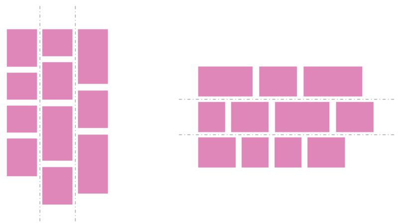
Source: Smashing Magazine CDN, Brosset, Dec 2025. The base scheme — columns and rows as independent axes.
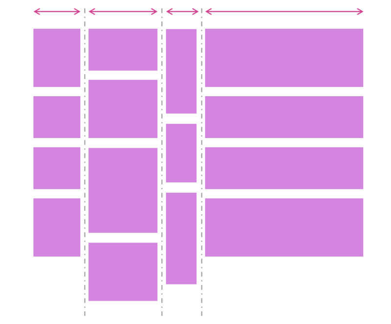
Source: same. Tracks of varying widths — controlled through CSS properties.
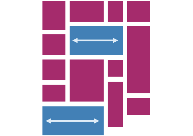
Source: same. An item can span several tracks at once.
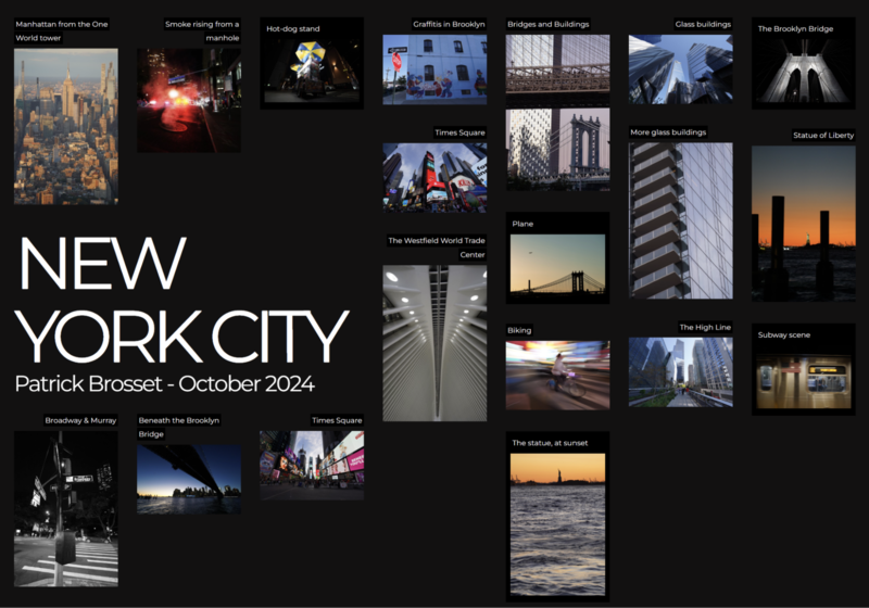
Source: same. A concrete example of a photo gallery with items on multiple tracks.

Source: same. Same idea, different arrangement.
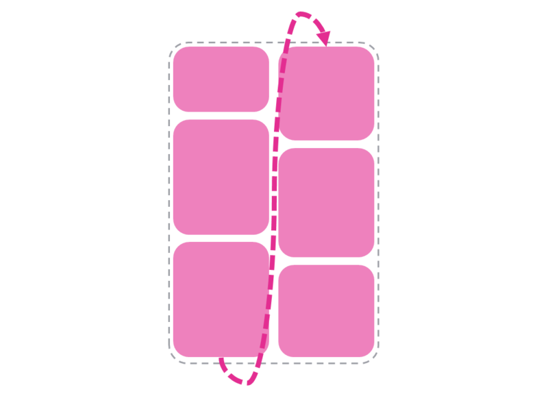
Source: same. A workaround through flexbox — works, but with limitations. Use as fallback until the native CSS implementation lands.
Brosset's article from December 2025 says: native display: grid-lanes is "just starting to be implemented" in Chromium, webkit and mozilla are in progress. By mid-2026, it is likely available in the Chromium family, but not Baseline. Choosing masonry today is a choice between waiting for native support or paying 24KB + 600ms for a JS library in exchange for the aesthetic.
A fixed column grid (3–4 columns), but each cell has its own allowed aspect ratio (4:3, 1:1, 3:4, 16:9). The photo fits through object-fit: cover.
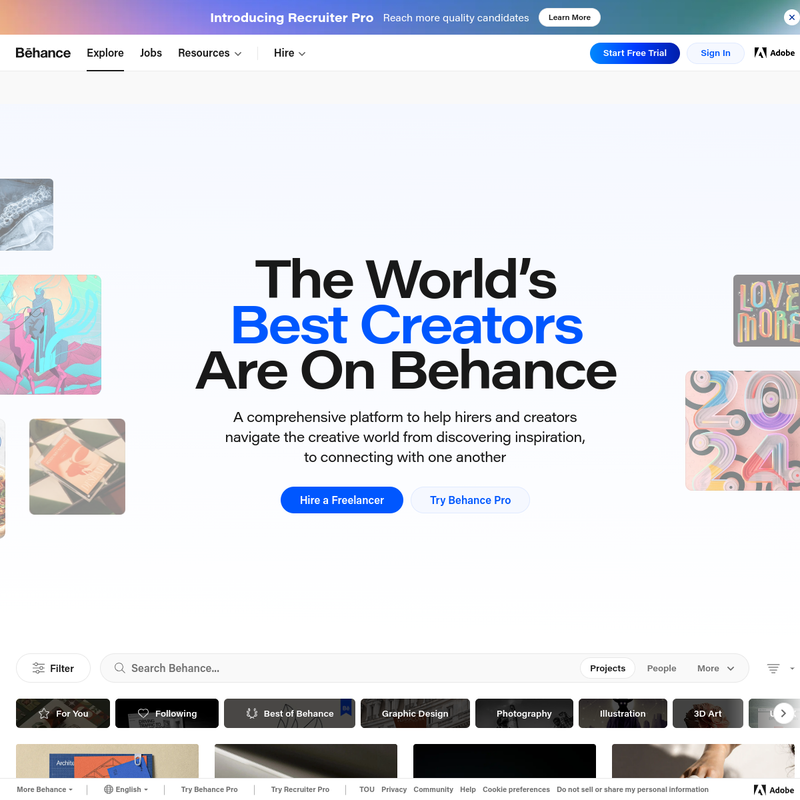
Screenshot of Behance via image.thum.io. A canonical example — fixed column grid, cells of varying proportions, content fitted through cover.
When it works. Editorial sites, blogs, news sections, case showcases, any content where finding and browsing have to coexist. Canonical examples: Behance (homepage), Apple Newsroom, most editorial CMSs.
Why it works. The best compromise between aesthetics and predictability. The F-pattern still holds at the column level (the eye still scans the top row left to right), but the visual rhythm stays alive thanks to varying proportions. No JavaScript. No letterboxing — the photo fills the cell entirely, only the edges get cropped, not the composition.
The price. Edges get cropped on non-standard photos. If you shoot or curate content specifically for the cells, no problem. If the content is mixed and unknown up front, some shots will be cut badly. Solved by discipline: the in-frame composition must work when cropped to several ratios.
Implementation. Native CSS Grid with aspect-ratio and object-fit: cover. Retina-safe via srcset and sizes (Mat Marquis, A List Apart, 2018, web.dev). No JavaScript.
This is the safe default for an unknown case. If you don't know which layout to pick and don't want to run an A/B test, take curated grid.
One or two large images at the top, followed by a standard grid of thumbnails below.
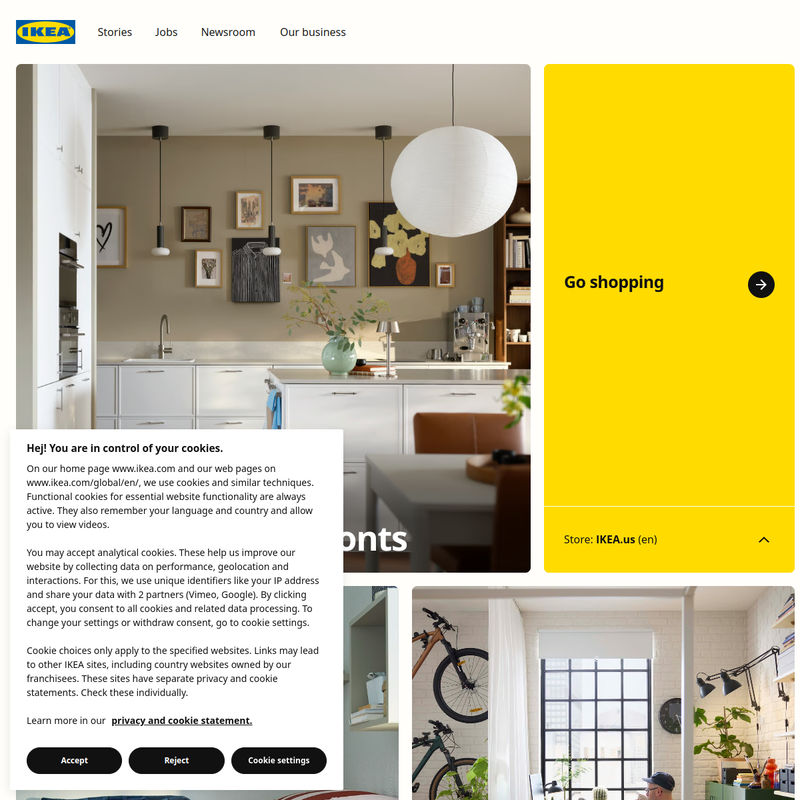
Screenshot of IKEA via image.thum.io. One large hero block up top taking ~50% of the screen, followed by a grid of previews of other rooms.
When it works. Landing pages, case showcases, photography portfolios with one or two "hero" works. The same pattern is on Erik Johansson and Kristian Hammerstad homepages, and on Apple product pages.
Why it works. Per NN/g, Scrolling and Attention, 2018, 57% of viewing time is above the fold. The hero photo gets the lion's share of attention. Clear hierarchy: emotion first (big photo), then options (grid).
The price. One photo eats the space. Scroll depth suffers — most of the content lands below the fold. Not suitable for catalogues with dozens of items.
A horizontal strip with stepped scrolling. The typical example is variants of one product on an Amazon product detail page: different angles, different colours.
When it works. Comparing related images of a single object. Alternative angles of a product, photos of one hotel from different points, screenshots of one screen in different states.
Why it works. Compact vertically. Convenient when the user is already inside one "entity" (product, hotel, project) and browsing its details.
The price. NN/g warns against horizontal scrolling on desktop (Katie Sherwin, NN/g). Discoverability is low: the user does not know there is more. Suitable only for related variants of one object — not for different objects.
No public screenshots in this material: both Amazon product detail and Booking hotel detail require authentication or cookies, and image.thum.io does not return them.
Not layouts themselves, but inseparable from the gallery. Eyetracking explains why masonry + infinite scroll is a bad combination for find.
Pagination — a grid of 24–36 items, with "1 2 3 ... Next" at the bottom. Works for find: the user remembers "this is on page 3", and knows how much is left. The footer stays put.
Infinite scroll — an endless feed, loading on scroll. Works for browse: the user wanders, the feed never ends. But NN/g says it directly: for goal-oriented tasks, this is bad (Hoa Loranger, NN/g, 2014). Choice paralysis, missing footer, lost position.
The main mistake is pairing masonry with infinite scroll in a product catalogue. That is the killed-find logic right there.
Five images from NN/g, on which everything else rests. This is not "opinion" — it is measurements.
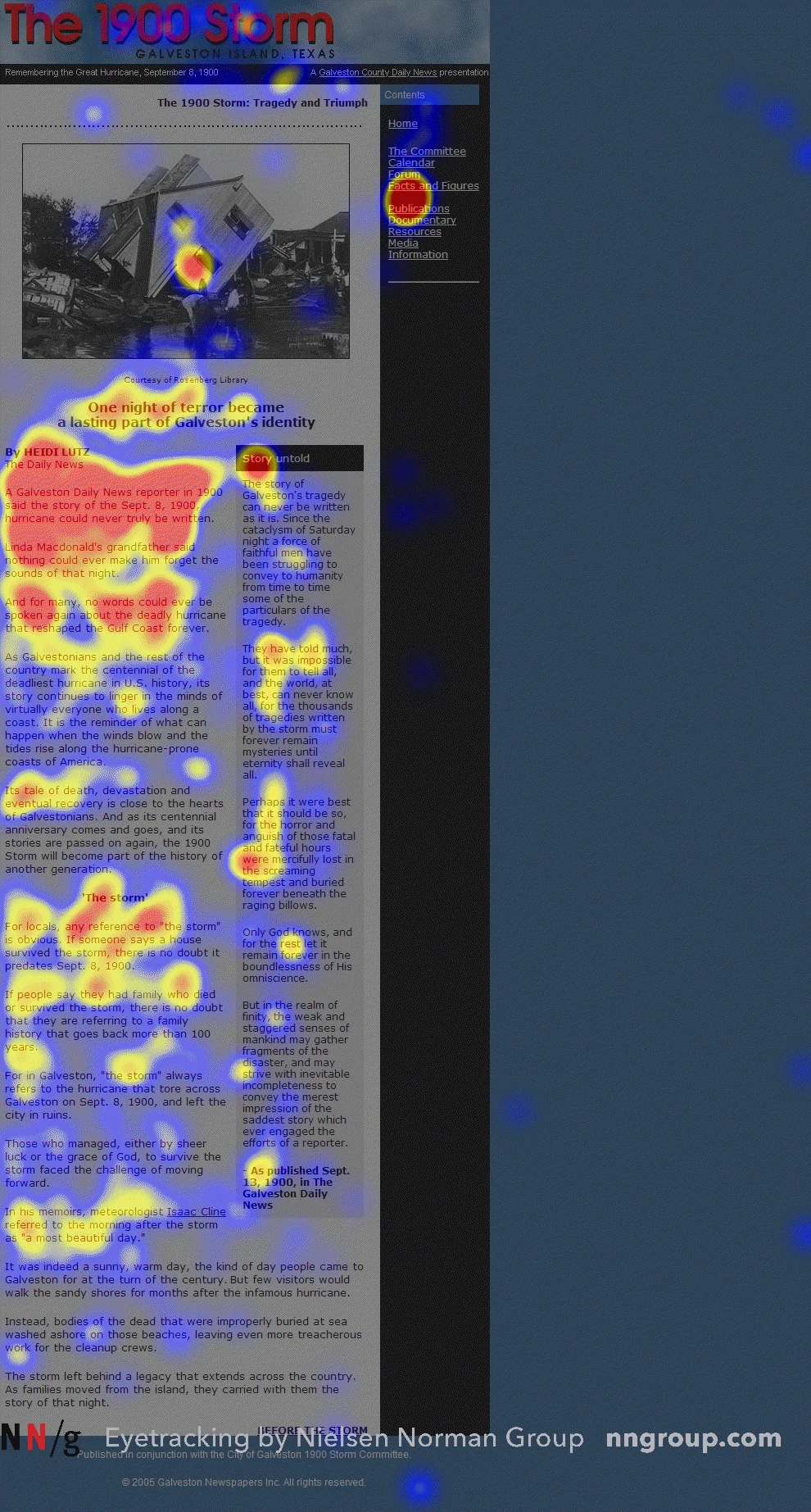
Source: Kara Pernice, "F-Shaped Pattern of Reading on the Web", NN/g, 2017. The eye scans the first row left to right, then the second row shorter, then the third shorter still. Uniform grid is compatible with this pattern; masonry is not.
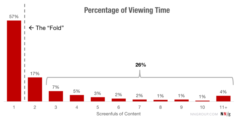
Source: Therese Fessenden, "Scrolling and Attention", NN/g, 2018. 57% of viewing time on the first screen, 74% in the first two screens, a sharp drop after the fold. Hero + grid relies on exactly this.
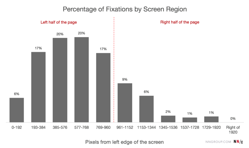
Source: Therese Fessenden, "Horizontal Attention Leans Left", NN/g, 2017. 80% of fixations land on the left half of the page, peaking around 600px from the left edge. This means: in any layout, the first photo in the top-left corner gets the most attention — whether the layout is masonry or grid.
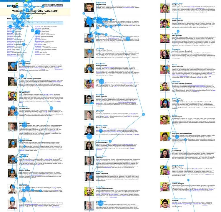
Source: Jakob Nielsen, "Photos as Web Content", NN/g, 2010. Informative photos (real people, products, landmarks) are actively studied. Decorative ones are ignored. This is about the content of the photo, not the layout, but it has an effect: in masonry, decorative photos are often the problem — they create noise without value.
Source: same. An enlarged photo on click — the user wants to see details. NN/g recommends enlargement ≥ 2x.
These five images together answer 80% of the questions about photo gallery layout. F-pattern → uniform grid. Above-the-fold → hero + grid. Left-leaning attention → the first photo always goes in the top-left corner. Informative photos → the user studies them, enlargement is needed. Decorative photos → the user ignores them, drop them.
A summary table. This is not "the only right answer" — it is the default for each scenario.
| Scenario | Layout | Pagination | Why |
|---|---|---|---|
| E-commerce categories (products) | Uniform grid, single aspect ratio | Pagination 24–36 | F-pattern, comparison, zero JS, best LCP |
| Service catalogues (hotels, restaurants) | Uniform grid or curated grid | Pagination | Option comparison, predictability |
| Photo community / inspiration (Pinterest, Unsplash) | Masonry | Infinite scroll | Browse mode, density, aesthetic |
| Photography portfolio (Erik Johansson, Kristian Hammerstad) | Hero + grid or masonry | Pagination | Sell 1–2 hero works + the rest |
| Editorial / news / blog | Curated grid | Pagination | Compromise between aesthetics and predictability |
| Landing page | Hero + grid | — | Hero sale, the rest is options |
| Product detail page | Horizontal filmstrip | — | Variants of one object |
| Unknown case, no A/B test | Curated grid, 3–4 columns, object-fit: cover |
Pagination 24–36 | Safe default |
What not to do. Masonry + infinite scroll in a product catalogue. Horizontal filmstrip for unrelated objects. Uniform grid with a 1:1 aspect ratio for vertical portraits — half the frame is lost.
This is not theory. This is a sequence of steps that worked in projects where I built galleries.
srcset. Zero JS, best LCP.display: grid-lanes to hit Baseline. Until then, fall back to a library with an explicit acknowledgement in a comment: "24KB + 600ms for the aesthetic, see PE-XXX".object-fit: cover, pagination. The safe default.The main thing — do not mix the modes in one grid. That kills both.
What happens if you put masonry in a product catalogue, or uniform grid in an inspiration section.
Masonry in find mode. The user is looking for a specific product, cannot remember where they saw "that blue sweater" — the cards are different heights, scanning is unpredictable. They leave. Per NN/g — higher cognitive load, "choice paralysis", missing footer. Conversion drops.
Uniform grid in browse mode. The user came for inspiration, sees 24 square cells. Thirty seconds later they realise: "there is nothing new here, it's cropped down". Engagement drops. Pinterest would never have built their business on uniform grid.
Hero + grid in a catalogue. One product takes up half the screen, the other 200 are below the fold. Per NN/g, 74% of viewing time is in the first two screens, the rest is ignored. Most of the catalogue is dead.
Curated grid with a 1:1 aspect ratio for vertical content. Half the photos get cropped top and bottom — the main subject (a face, a product) is lost. Engagement drops, bounce rate climbs.
The "if you pick wrong" scenario boils down to one thing: the layout does not match the user's behaviour. The data is there — NN/g eyetracking, Brosset's masonry cost, the F-pattern. Ignore it and you are picking the layout by feel.
This material came out of several projects where I built galleries — from e-commerce categories with tens of thousands of products to editorial CMSs and photography portfolios for creative agencies. I kept hitting the same rakes. Masonry where find was needed — and conversion dropped. Uniform grid where browse was needed — and engagement dropped. A hero block eating half the catalogue — and 80% of the products landed below the fold.
I overlaid the 2010–2018 NN/g eyetracking data on those cases with hindsight, and they explained every observation, no exceptions. That is origin grounding: not "I invented a theory", but "I observed the same mistakes across projects, and there is public data that explains why".
From there — the browse vs find framing, the curated grid safe default, the decision matrix. This is not an academic exercise in causality; it is a generalisation of practice through ready-made data that I did not collect myself.
This is an analytical review, written on the basis of gallery-building practice in high-load projects and public UX research. There is no academic breakdown of causality, no proprietary A/B test of masonry vs grid on an audience, and no claim to a universal model. Every number in the text is either an NN/g measurement or a measurement by Patrick Brosset (Smashing Magazine, Dec 2025). If you see the same thing — open an issue with a counter-example or an alternative source. If you see it differently — all the more interesting.
Sources verified on: 2026-08-05.